
Hekla Travel
Travel experiences in Northern Europe
ByP Travel is a travel agency from Copenhagen that offers trips to the northern countries and wants to expand its business. Not only they want to sell their own round trips but to offer the ability for any company to publish their trips in this platform.
Context
The current interface was focused mostly on clients from Scandinavian countries and the information of the trips was not very clear. It also needed some new styling more related to the experiences they were selling.
Problem
Extensive talks to the company’s owner from hand sketches to final design while changing the scope several times across the years.
Design process
A website that went from a regular trips site to the go to platform for every travel company.
Results
My role: Lead UX/UI Designer
Status: Shipped in 2022

How can Helka get to more people?
Hekla, formerly known as B&P Travel had a brand color that was red inspired by an Icelandic vulcano. We had to give it a most modern and trustworthy look so people could be safer booking a trip online.
The company’s idea


First the main user was Scandinavian people traveling around the Nordics. Not the main user persona would be a 50yo woman from the US preparing a trip with her family around Northern Europe.
The main user persona
The company wanted to offer the users the possibility to edit their trips according to their needs. So far every company was offering closed packages and they wanted to provide more flexibility to people.
The existing website

Where should be put the focus on?
We created some hand-sketches together with the client and then slowly converted them into lo-fi and mid-fidelity wireframes.


The feedback from the client
Even though the sketches aligned with the first idea of the company’s owner, after seeing it all together he understood that this idea was too ambitious. He decided to go for a facelift of the current website first, while simplifying the flow and making the website easier to use, and then slowly overtime add some of these new features.
How can we improve the existing website?
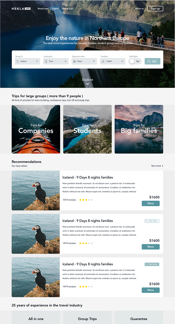
Design a clean interface that make the users feel safe and comfortable
Use great nature images taken by the company’s photographer
Reuse flows that the users were already familiar with.
Display all the info about the trips with visuals to be as clear as possible.
Emphasize on trips for big groups such as companies, students or families
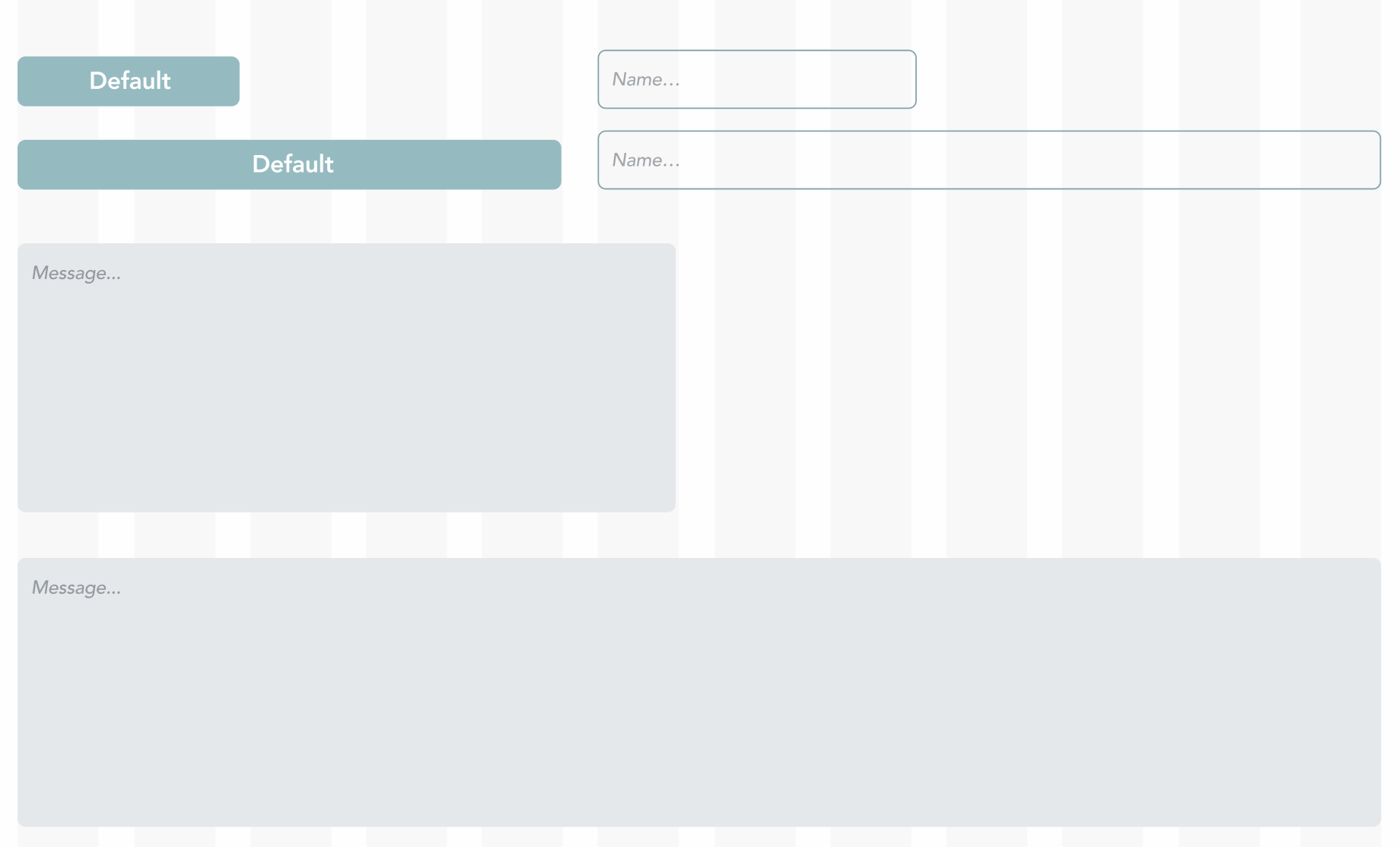
User Interface
The interface had to be simple and clean, using colors and a language that people felt familiar with and with a strong presence of the nature of the nordic countries.
1 . Guiding principles
Simple | Familiar | Clean | Nature-like

2. Color palette
Primary colors
Alert/Success colors


3. Typography
4. Icons
The size of the icons used was 20px wide 20px high. The icons were from FlatIcon so could be downloaded and free to use.
5. Grid and responsiveness
The grid was 12 columns, with a width of 1040px and a gutter of 24px. Breakpoints were 768px for tablet and 414px for mobile devices. All items were set to be responsive with tablet and mobile versions.

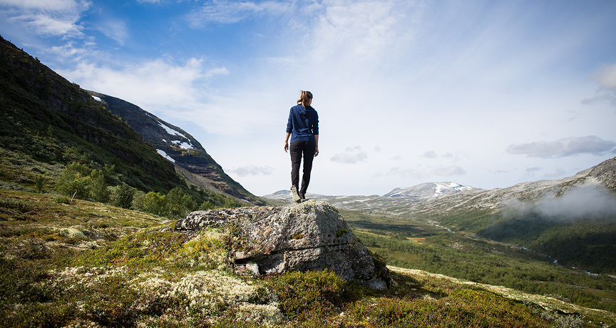
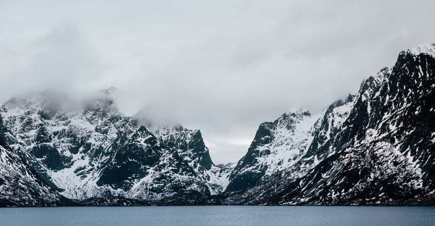
6. Moodboard and images
Images were desaturated and simple in motive, with a focus on people in nature.
High fidelity wireframes


Next steps
When Hekla was ready to be implemented and shipped, the client did some last minute changes to the design with the developers. And then the pandemic happened.
A couple of years after, the client contacted me again to work on some new add-ons. During the pandemic, with nobody traveling due to the lockdown, the owner of Hekla decided to go big and make of Hekla the Amazon of trips and excursions. They wouldn’t only sell their own products, but allow other companies to sell their trips in this platform. That meant that we had to make some adjustments to the design to market better the different locations.
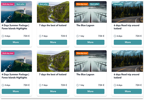
We decided to add contrast colors in the trips cards (such as pink and orange) to distinguish better between “One-day trips” and “Multi-day tours”.
New colors to differentiate trips
Links to landing pages

Because of SEO reasons, we created links to different landing pages and decided to display them on the home page to make it easier for the suers.
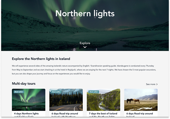
Now the users could reach landing pages focused on different destinations to find round trips and one-day activities related to them.
The landing pages